
Thursday 19 November 2015
Thursday 12 November 2015

Thursday 5 November 2015
Contents Page Analysis
Contents Page Analysis
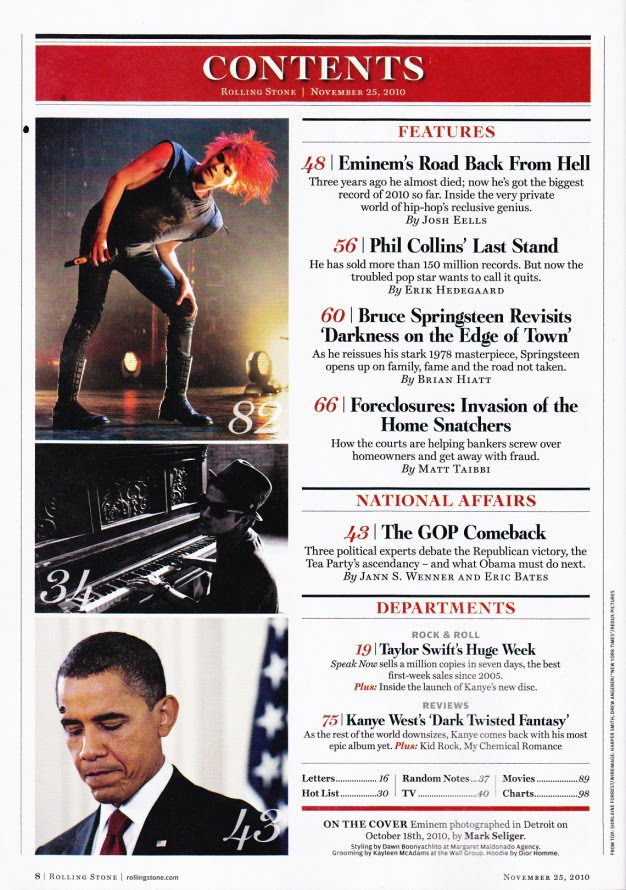
- This contents page is quite simple, with the articles being listed on the right side of the page downwards, and the pictures alongside each article.
- The colour scheme for this contents page is red on white, this is a good contrast as the red stands out on the white background, the black text also contrasts the white background making it easily seen and more visible.
- The contents are split into segments, the first being Features, a look at some of the key articles in the magazine or the ones that readers are more likely to be looking for. The second is about National Affairs, Rolling Stone magazine also covers some elements of politics in its magazine, allowing an easy route for that specific audience to find the correct page. The last article is about Departments. By sorting the articles like this, it makes each article easier to reach for each reader and also makes the magazine more accessible for several audiences.
- The images seem to be linked to their respective articles, this also helps to highlight some of the more significant articles, as well as allowing readers to identify an article. For example, when you can recognise someones face, but just can't remember their name.
- The language used in the contents page is formal,
- All fonts used on the contents page are Serif fonts.
Double Page Spread Analysis
Double Page Spread

- The Picture in this double page spread has bled onto both pages, making it stand out across the two pages. This makes the article easily identified as a double page spread.
- The Photograph contrasts any background colours, this helps the image stand out, drawing attention to it.
- The main article has been put into columns and placed into the bottom right corner of the double page spread, this helps the spread to look neat and tidy, overall. As well as providing more space for the image which should bleed on to both pages.
- The article uses an initial letter to begin, and the font used is different to the main text. This helps to draw attention to the actual article, as well as maintaining a unique, and stylised look.
- Above the article is a small paragraph which summarises the main content of the article, and the point it is trying to make. USA is seen in the background, this also stands out on the white page, is also another reference to the article as a whole.
- The headline to the article has been put into a stylised font, this also makes the page look more aesthetically pleasing, as well as providing more of an insight into the article.
Pitch
Pitch
Idea:
I want my music magazine to cover pop through time, specifically in the last 60-70 years, I also want my magazine to look more in to the world of entertainment and film, as well as being about music. Some similar magazines to this would be Rolling Stone and Mojo, both of which cover a wide variety of music both past and present, Rolling Stone also looks at some elements of entertainment instead of being solely based on music.
Institution:
I think that the institutions Bauer Media, or Wenner Media may like to publish a magazine like mine, as they both publish magazines with similar genres to mine, while it still remains individual and unique.

Target Audience:
The desired target audience for my magazine will be from the ages 16 to 25, but it could also apply to those above that range. My magazine will cover a range of different pop music through the last 60-70 years so the audience will need to be mature and have a passion for pop music as a whole and not just contemporary pop.
Style:
I want my magazine to have a more vintage look to it, possibly looking like it was created in anywhere from the 60s to 80s, this would give the magazine a much more stylised and unique look and would also link heavily to my genre of pop music both past and present.
Similarly, the magazine could also feature some black and white, and grey colours to give it a much more classic look - but not too much, as this would make the magazine look dull and boring.

Double Page Spread:
My Double Page Spread could feature an artist or band from today whose music has been inflicted by music from the past, or possibly about an artist that covers music from the past. This would suit the genre of the magazine as it aims to focus on music from both the past and the present.
The Double Page spread will need to feature a photograph (and masthead) that covers two pages, as well as an article based on that photograph. The double page spread should fit in with my house style and colour scheme so that it fits in with the rest of the magazine.
Masthead Development

All three of the mastheads are using Serif fonts, such as Rockwell Extra Bold and Lucida Calligraphy, because I think they look more formal as a whole however they also put a much more stylised appearance into my whole cover to emphasise the unique and original genre, or theme, I have chosen of pop and entertainment through time.
The colours I have chosen seem to be quite bleak and bland, but this should be contrasted by the colours in the background, alternatively they could be reworked to look slightly more vibrant although this should not become a problem.
The first and last mastheads are quite tightly tracked, this does help add to the formality of the mastheads, however the first one does start to look rather messy whereas the third has a more clean, straight look to it.
Subscribe to:
Posts (Atom)