Contents Page Analysis
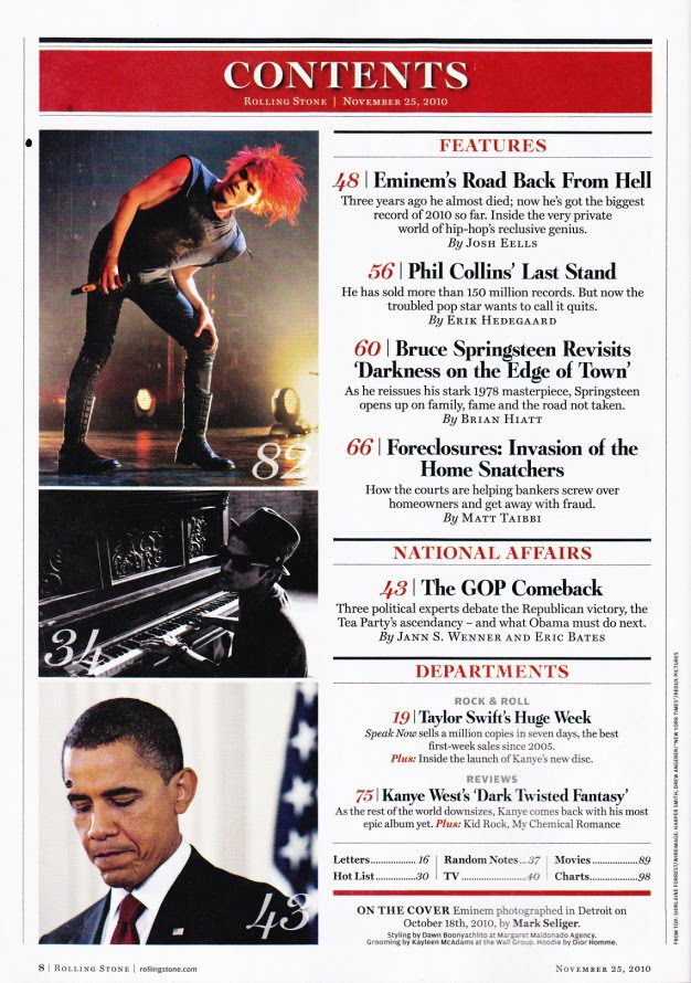
- This contents page is quite simple, with the articles being listed on the right side of the page downwards, and the pictures alongside each article.
- The colour scheme for this contents page is red on white, this is a good contrast as the red stands out on the white background, the black text also contrasts the white background making it easily seen and more visible.
- The contents are split into segments, the first being Features, a look at some of the key articles in the magazine or the ones that readers are more likely to be looking for. The second is about National Affairs, Rolling Stone magazine also covers some elements of politics in its magazine, allowing an easy route for that specific audience to find the correct page. The last article is about Departments. By sorting the articles like this, it makes each article easier to reach for each reader and also makes the magazine more accessible for several audiences.
- The images seem to be linked to their respective articles, this also helps to highlight some of the more significant articles, as well as allowing readers to identify an article. For example, when you can recognise someones face, but just can't remember their name.
- The language used in the contents page is formal,
- All fonts used on the contents page are Serif fonts.
No comments:
Post a Comment