
Thursday 19 November 2015
Thursday 12 November 2015

Thursday 5 November 2015
Contents Page Analysis
Contents Page Analysis
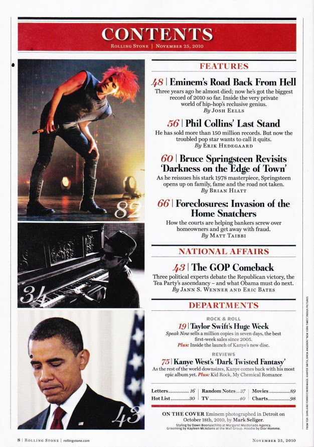
- This contents page is quite simple, with the articles being listed on the right side of the page downwards, and the pictures alongside each article.
- The colour scheme for this contents page is red on white, this is a good contrast as the red stands out on the white background, the black text also contrasts the white background making it easily seen and more visible.
- The contents are split into segments, the first being Features, a look at some of the key articles in the magazine or the ones that readers are more likely to be looking for. The second is about National Affairs, Rolling Stone magazine also covers some elements of politics in its magazine, allowing an easy route for that specific audience to find the correct page. The last article is about Departments. By sorting the articles like this, it makes each article easier to reach for each reader and also makes the magazine more accessible for several audiences.
- The images seem to be linked to their respective articles, this also helps to highlight some of the more significant articles, as well as allowing readers to identify an article. For example, when you can recognise someones face, but just can't remember their name.
- The language used in the contents page is formal,
- All fonts used on the contents page are Serif fonts.
Double Page Spread Analysis
Double Page Spread

- The Picture in this double page spread has bled onto both pages, making it stand out across the two pages. This makes the article easily identified as a double page spread.
- The Photograph contrasts any background colours, this helps the image stand out, drawing attention to it.
- The main article has been put into columns and placed into the bottom right corner of the double page spread, this helps the spread to look neat and tidy, overall. As well as providing more space for the image which should bleed on to both pages.
- The article uses an initial letter to begin, and the font used is different to the main text. This helps to draw attention to the actual article, as well as maintaining a unique, and stylised look.
- Above the article is a small paragraph which summarises the main content of the article, and the point it is trying to make. USA is seen in the background, this also stands out on the white page, is also another reference to the article as a whole.
- The headline to the article has been put into a stylised font, this also makes the page look more aesthetically pleasing, as well as providing more of an insight into the article.
Pitch
Pitch
Idea:
I want my music magazine to cover pop through time, specifically in the last 60-70 years, I also want my magazine to look more in to the world of entertainment and film, as well as being about music. Some similar magazines to this would be Rolling Stone and Mojo, both of which cover a wide variety of music both past and present, Rolling Stone also looks at some elements of entertainment instead of being solely based on music.
Institution:
I think that the institutions Bauer Media, or Wenner Media may like to publish a magazine like mine, as they both publish magazines with similar genres to mine, while it still remains individual and unique.

Target Audience:
The desired target audience for my magazine will be from the ages 16 to 25, but it could also apply to those above that range. My magazine will cover a range of different pop music through the last 60-70 years so the audience will need to be mature and have a passion for pop music as a whole and not just contemporary pop.
Style:
I want my magazine to have a more vintage look to it, possibly looking like it was created in anywhere from the 60s to 80s, this would give the magazine a much more stylised and unique look and would also link heavily to my genre of pop music both past and present.
Similarly, the magazine could also feature some black and white, and grey colours to give it a much more classic look - but not too much, as this would make the magazine look dull and boring.

Double Page Spread:
My Double Page Spread could feature an artist or band from today whose music has been inflicted by music from the past, or possibly about an artist that covers music from the past. This would suit the genre of the magazine as it aims to focus on music from both the past and the present.
The Double Page spread will need to feature a photograph (and masthead) that covers two pages, as well as an article based on that photograph. The double page spread should fit in with my house style and colour scheme so that it fits in with the rest of the magazine.
Masthead Development

All three of the mastheads are using Serif fonts, such as Rockwell Extra Bold and Lucida Calligraphy, because I think they look more formal as a whole however they also put a much more stylised appearance into my whole cover to emphasise the unique and original genre, or theme, I have chosen of pop and entertainment through time.
The colours I have chosen seem to be quite bleak and bland, but this should be contrasted by the colours in the background, alternatively they could be reworked to look slightly more vibrant although this should not become a problem.
The first and last mastheads are quite tightly tracked, this does help add to the formality of the mastheads, however the first one does start to look rather messy whereas the third has a more clean, straight look to it.
Thursday 22 October 2015

Thursday 8 October 2015
Analysis for Initial Ideas 2

Mojo Magazine
Genre: Pop
Institution: Bauer
Target Audience: Older Generation, looks at Pop through time, undefined to one genre or theme.
Analysis: The Masthead quite commonly contrasts the primary colour on the cover, white on black (above), although black on white is also a possible combination. The coverlines also contrast well with the background, as well as the splash, this helps them to stand out and grab a readers attention. The Masthead is always the same, which is good for brand identity, meaning that the magazine is always easily spotted and recognizable by consumers.
The central image commonly features a celebrity or celebrities who are featured prominently later in the magazine. The splash also outlines the central image as well as the article later on in the magazine.
The articles featured in the magazine feature both contemporary and older artists and bands meaning it applies to several different generations and many different genres and themes.
Analysis for Initial Ideas 1

Genre: Pop / Classic Rock
Sub-Genre: Film / Entertainment / Politics
Institution: Wenner Media LLC / Publisher: Jann Wenner
Target Audience: Mainstream, Wide Audience, does not seem to apply to a certain age range or theme although it may be preferred by those slightly older, 15 upwards perhaps.
Analysis: The Masthead refers to several different themes, such as Blues Songs, Rock Songs and even a Rock and Roll band therefore giving it a much more appealing look to older people, around 30-40 or onward.
The House Style is very contrasting, allowing itself to stand out. The red and black Masthead, for example stands out against the all-white background. The colour scheme on the coverlines are also quite stereotypical, themed colours as this issue of the magazine was released in December, close to Christmas.
The magazine is easily recognizable by its masthead, which is a part of every issue. The magazine also quite commonly has a black on white theme, coverline text normally contrasts the central image.
The Central Image shows a character from a popular film, most readers would quickly identify the character and those interested in the film may choose to pick up the magazine for that purpose. The focus on film characters also shows that the magazine is not primarily focused on music, despite still being a major factor.
The Splash of the magazine is related to the central image, showing that the primary article of the magazine is also featured on the front cover. This shows the article that is most important for the issue and is most likely to attract more readers. The Splash is also anchorage text, it fixes the meaning of the image behind it so there is no confusion.
The Cover lines show that the Magazine is also focused on multiple different things, though primarily Music. It also focuses on film, TV and more. Artists, Albums and individual singles however seem to be a more significant part of the magazine.
Initial Ideas for a Music Magazine
Initial Ideas
My Initial ideas are:
- A Pop Magazine that focuses on the evolution of what Pop was throughout the decades, e.g 50s, 60s, 70s, 80s Pop etc. Because, as every new decade comes It comes with it's own genre of Pop, while others are lost to the ages, forgotten or take on new names. I think this would be unique as most Pop magazines only base themselves around today's music, but I would aim to look more in to the past instead of the present.
- A Music Magazine that also ties into popular films, looking into some elements of the film industry, perhaps looking into the Music for certain films, their soundtracks and so on. This could also look at how Music and Film are linked, and the effect music can have on film.
Music Magazine Market
The Music Magazine Market
The Images below were created to resemble the music magazine market today. The pictures show magazines aimed at both a mainstream, mass audience and a niche, specialist, theme. Also included are magazines applying to a certain instrument, as they are also included as specialist sub-genres of music.


Introduction to Main Task
Introduction to Main Task
Wednesday 7 October 2015


Tuesday 6 October 2015
Evaluation
Evaluation Questions
1. In what ways does your student magazine use, develop or challenge forms and conventions of real media products?
My Magazine cover needed to feature some of the main elements of a typical magazine cover, It needed to have a Central Image, Masthead and Coverlines in particular, which I made sure to include. Without these, the cover would likely not look similar to a magazine.
2. How does your student magazine represent particular social groups?
The social group my magazine represented was Students, primarily. I believed that my magazine does apply to the targeted social group, covering all sorts of issues and articles related to young people in college.
3. What kind of media institution might distribute your magazine and why?
My magazine did not explicitly apply to only one location, so It could be distributed as part of any college in the country. Perhaps even getting students involved, sending in their own articles to be published in the magazine.
4. Who would be the audience for your student magazine?
Anyone just starting out at college, whether confused or completely confidence. Everyone needs a hand in the early parts of college life, and those who don't could always do with knowing more about their area and college respectively.
5. How did you attract/address your audience?
The house style I used for the magazine was used intentionally to attract to a more youthful audience, using quite vibrant colours and simple fonts, however the content is still quite formal so the magazine does not come across as childish or inappropriate.
6. What have you learnt about technologies from the process of constructing the student magazine?
I have learned how to use Blogger to post periodic updates to my magazines creation process. I primarily learnt a lot about InDesign which I had not used before, grasping most of the basic tools. Learning about InDesign now will allow me to have a much smoother experience with my future coursework for the subject.
Thursday 24 September 2015

Fonts, Colour Schemes, Mode of Address
Fonts
Arial Arial Arial Arial Arial
Courier Courier Courier Courier Courier
Georgia Georgia Georgia Georgia Georgia
Times Times Times Times Times
Verdana Verdana Verdana Verdana Verdana
Colour schemes


Mode of Address
The magazine needs to draw peoples attention, and the content inside must be direct, and to the point. However, the content is best to be informal. A formal, more serious, tone would not work well with the target audience and may cause some readers to turn away.
The content should have some elements of directness and seriousness, however it should also adopt a more fun an youthful tone.
Similarly, the title to the magazine will need to be something short and catchy. Preferably one or two words. The title will need to be colourful in order to draw peoples attention, although not too colourful as to make the magazine look childish.
Research for Target Audience
Research for Target Audience
What sort of title would you expect a Student magazine to have?
The title should be relevant to the features in the magazine, so it must be relevant to Students and Students Life. It should be short and sweet.
How much would you expect a Student magazine to cost?
Anywhere from £2 to £3.
What sort of images would you expect to see in a Student magazine?
Pictures relevant to the articles, as well as images of locations around the college and local area.
What sort of language style would be used in a Student magazine?
Slightly informal, but still with some elements of formality to it. Aiming to still get a point across, although not seeming too serious.
What sort of things could potentially be promotional offers in a Student magazine?
Discounts and special offers with local businesses around the local area to readers of the magazine.
What would be the ideal content for a Student magazine? What topics would it cover, and how could it execute them?
It should cover the trials and tribulations of college life, and how to manage with those problems. How to manage with stress and how to balance out your time for directed study or coursework.
There could even be sections for local politics in the area, or future developments or events coming up in or around the college.
Initial Ideas for Student Magazine
Initial Ideas for Student Magazine
House Style: The house style must not be too dull. Lighter more vibrant colours, although not too vibrant. Must look serious, although not too dull, but must also avoid looking too childish with colours too extreme.
Mode Of Address: The most suitable style of text seems to be informal, as it is the easiest to comprehend for the target audience, and it keeps the magazine from being too complicated.
Central Image: The Central Image must be relevant to the overall theme of the magazine. Normally a picture of a celebrity or well known person(s), however this is not compulsory.
Content: A Magazine cover needs to list some of the features further on in the issue. Similarly the contents page could offer a much more detailed look at what is to come in the magazine.
Use of Language: The Language used in the magazine must not be too complicated, should be easy to understand for the reader.
Cover Lines: Cover Lines should be used to highlight some of the other features in the magazine, although it should not highlight the same article as the Central Image.
Masthead: The Masthead must be bold and eye-catching in order to draw peoples attention, it must also be something relevant to the magazine as a whole. Should also be short, normally one or two words.
Puff: A Puff is not too important, although it could help to draw people in to a magazine, with mentions of promotional offers.

Thursday 17 September 2015
Introduction to Prelim Task
Introduction to Prelim Task
I am working towards creating the Front Cover and Contents page of a new Student Magazine.
Week 1: Research and Planning
14th - 21st September
Week 2: Production
21st - 28th September
Week 3: Production
28th September - 5th October
Week 4: Evaluation
5th - 9th October
Deadline: Friday 9th October
Subscribe to:
Posts (Atom)